Publish Date
Sept 20, 2024
Project Type
building a design system
Client
David Phillips
Duration
On-going work
Location
London, UK
Brand Identity Redesign
Rebuilding the foundation of a future-facing brand
Following years of rapid growth, platform launches, and sector diversification, David Phillips needed a comprehensive visual overhaul. The goal was to establish a modern, scalable identity system that reflects the company's leadership in property furnishing — while enabling seamless execution across digital platforms, client segments, and partnership channels.
My role
These operational improvements had an immediate impact, helping the team scale consistently across departments that had previously lacked creative workflow discipline.
Design System: Atomic Thinking
To ensure clarity and consistency across UI, marketing, and partner-facing assets, I built the brand on an atomic design system. This modular structure supports future scalability and rapid asset creation — from email banners to web platforms.
- Atoms: Typography, colours, iconography, spacing
- Molecules: Logo/tagline lockups, badges, buttons
- Organisms: Cards, templates, section patterns
- Templates: Decks, brochures, digital pages
Core Identity Components
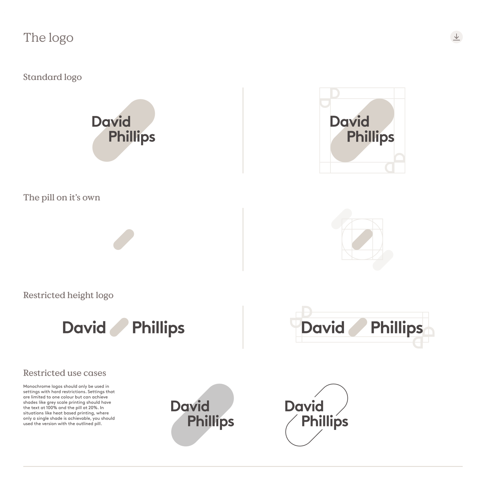
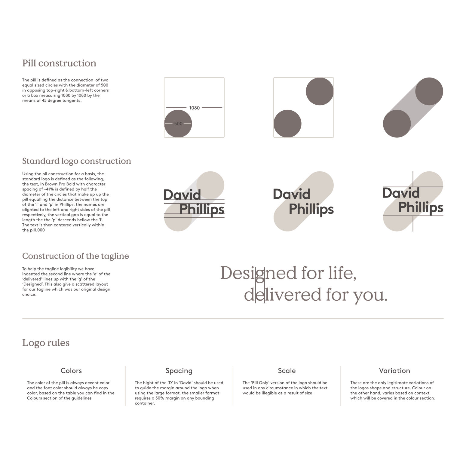
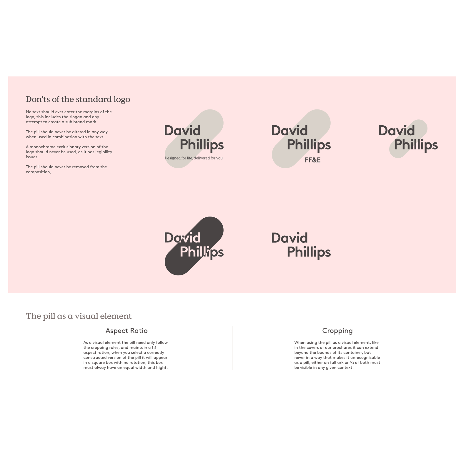
Logo Redesign & Usage Rules
The new brand statement — “Designed for life, delivered for you.” — captures the company’s customer-first, solutions-based ethos. I developed tagline lockups for use across digital, motion, and print, and defined their placement rules in combination with the logo.
Tagline System
The new brand statement — “Designed for life, delivered for you.” — captures the company’s customer-first, solutions-based ethos. I developed tagline lockups for use across digital, motion, and print, and defined their placement rules in combination with the logo.
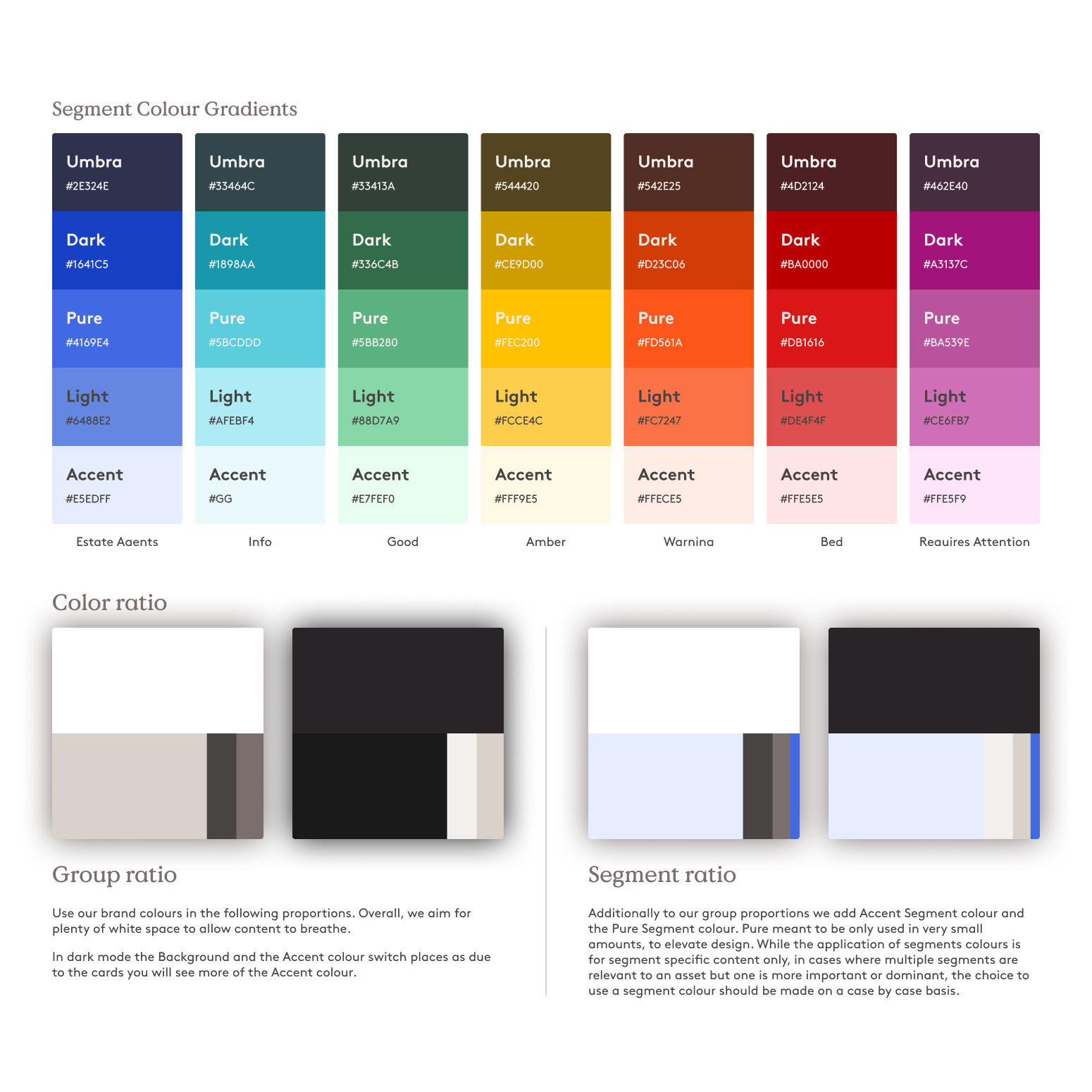
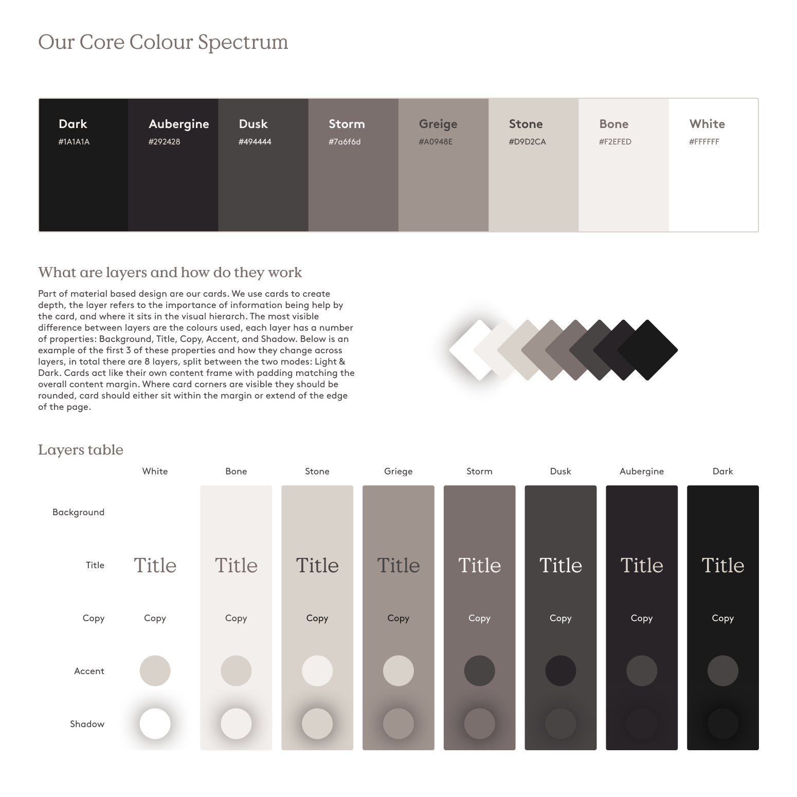
Layer-Based Colour System & Card Hierarchy
Inspired by material design logic, we introduced an 8-layer system, split across light and dark modes. These layers define content importance through depth and colour, particularly within cards — which serve as core visual containers across the identity. Each layer defines the following properties:
- Background colour
- Title style
- Copy colour
- Accent (e.g. icons, UI edges)
- Shadow / Elevation
Cards act as independent content frames with padding that mirrors the system-wide content margins. When visible, card corners are softly rounded. Cards can sit cleanly within a margin or bleed intentionally off the edge of a page — depending on purpose and emphasis.
This system establishes a visual hierarchy through depth, improving user comprehension and helping designers maintain clarity across complex layouts.
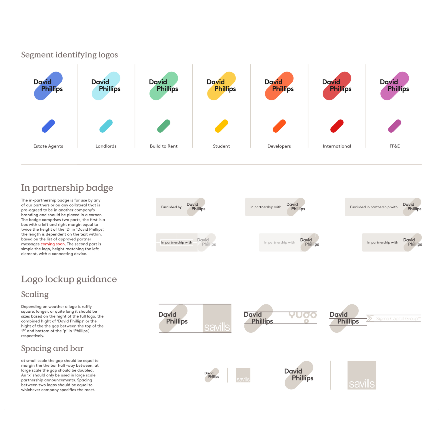
Colour Segmentation by Audience
We assigned a distinct colour to each of our key business segments. These colours were rolled out in presentations, brochures, iconography, and UI — enabling instant recognition without fragmenting the brand.
- Estate Agents – Blue
- Landlords – Teal
- Build to Rent – Green
- Student – Yellow
- Developers – Orange
- International – Red
- FF&E – Purple
Dual Branding & Partner Systems
To support external partnerships, I created a dual-branding framework with:
- Lockups for “In partnership with” and “In collaboration with”
- Rules for clear visual hierarchy and spacing
- Segment-colour overlays for joint campaigns
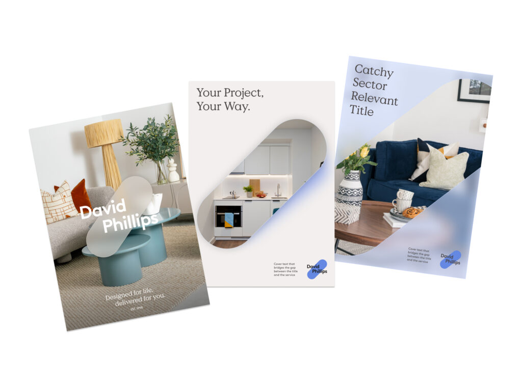
Brochure System – Pill-Based Visual Hierarchy
As part of the rebrand, we developed a structured brochure system that uses the pill graphic as a visual cue to indicate the scope and specificity of content. This system helps readers immediately understand whether they’re viewing a high-level overview or a focused service offer.
There are three tiers of brochures.
Top-level brochures present the company as a whole, covering the full range of services and sectors. These use a large pill, set against lifestyle imagery and the core brand colours, to reinforce their broad, introductory purpose.
Segment brochures focus on a single audience group such as Build to Rent, Student, or Estate Agents. These documents introduce the segment-specific colour and use a medium-sized pill. The content and structure are tailored to resonate with the selected audience while maintaining brand consistency.
Service brochures are the most specific tier. They dive into individual services — such as delivery, installation, or staging — and use the smallest pill to reflect this narrowed focus. These brochures inherit the segment colour from their parent category, ensuring visual continuity throughout the system.
Delivery & Rollout
- We built a live brand guidelines site
- Delivered a full Figma design system
- Created handoff templates for motion, social, and print
- Fixed asset request flow for internal and external parties
Delivery & Rollout
The brand system unified every visual touchpoint of the business — from B2B decks and social media to logistics, sales tools, and digital platforms like Link and Vamos. It significantly reduced production time, improved stakeholder alignment, and positioned David Phillips as a design-conscious leader in the furnishing industry.
With segment-based colour logic, scalable templates, and a layered design language, the identity is now fully future-ready — enabling growth across services, platforms, and markets.