A complete rebrand for T-Juice
Soon after I joined the company next to the everyday tasks of social images and online banners, I got commissioned to start to think about the rebrand project. The idea was to give a refreshed look to a brand which has well known design language in the space. I got told that the rebrand will be challenging given all the markets, variations and adaptations we have to look at and the project has started multiple times but never actually finished with a winning idea.
Logo
As always I like to start at the fundamentals, redesign the logo in a way that still represent the brand but by cleaning it up and make it look sleeker we can definitely use a similar design language but giving it a fresh look at the same time. Given that the recent package artworks started to incorporate the bolt as a design element and the brand did not have an icon during the brainstorm I have proposed that we should implement this into the logo and make it essential to the brand giving us creative way to use the logo and the icon. After introducing the bolt we have agreed that keeping the red color is great but we should change the position so the logo and the bolt don’t overlap, after trial and error we have ended up on this look.
Package Design
Most challenging part was the package design, multiple languages with the regulations in different countries and all the markets we sell goods had an effect on the overall design. Fundamentally I wanted to create a system to help customers select the right product by just glance at the package. For this reason I came up with a systematic approach on how to show the product type and the flavours.
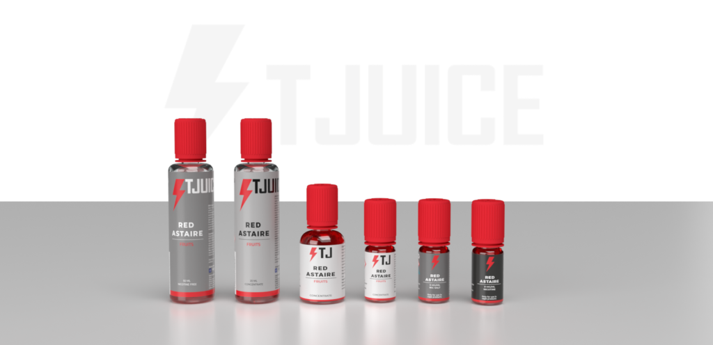
The Grey system
The first system I have created is aimed to solve the problem of selecting the right product type with ease. Dark colours are ready to use items, lighter colours are the more customisable items
- 10ml Premix – Black
- 10ml Salt mit – Grey
- Shortfill – Light Grey
- Longfill – Off-white
- 10ml & 30ml Concentrates – White
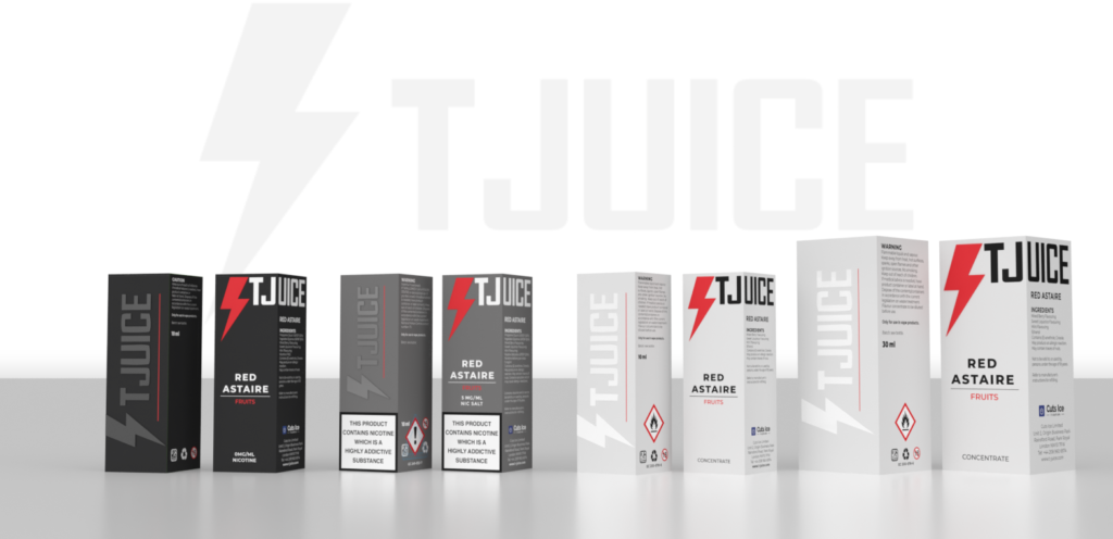
Flavour system
Each product has a colored line running across the bottom to addition to the coloured bolt which represents the flavour. Additionally to the colours we have introduced the categories under the flavour names to help an easier selection.
Additional details
We have made sure the we apply small details across the product pieces, like the spot UV finish over the logo on the back of the boxes, embossed Bolt icon on front and matt finish on the box to give a premium feel to the box on the first touch while keeping all of our boxes and labels 100% recyclable!
Brand Guidelines
After we managed to iron out all the details on the packaging we decided to note down all the rules we have created during the creation of the concept. Feel free to browse the document below.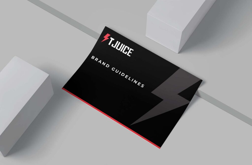
I must admit, it was a great project. I’m really satisfied how the final product turned out. It allowed me to learn great lengths about how different markets and regulations can effect a package design (thanks to the regulatory team from here!) and prototype different versions, test out finishes and discuss ideas with departments to achieve the best look and compatibility. All in all, I was able to give a fresh look to the brand but keep crucial elements from the previous iteration.
I’m certainly going to be proud when I look back on this project.
RELATED PORTFOLIO