Publish Date
Dec 15, 2020
Project Type
Complete re-brand & Packaging
Client
Cuts Ice
Duration
Variable
Location
London, UK
A COMPLETE REBRAND FOR T-JUICE
Soon after I joined the company, alongside my day-to-day tasks—such as creating social media visuals and online banners—I was commissioned to begin exploring concepts for a rebrand. The goal was to refresh the look of a well-established brand with a recognizable design language in the industry. I was told upfront that the rebrand would be challenging, given the number of markets, variations, and adaptations that needed to be considered. The project had been initiated several times before, but never reached a final, successful outcome—making this a unique opportunity to bring a fresh perspective and push it forward.
LOGO
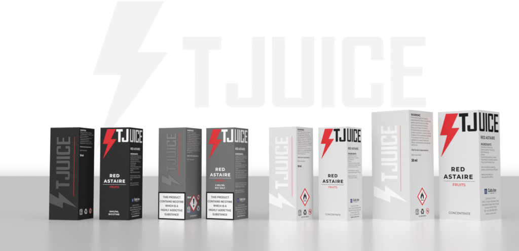
The most challenging part of the rebrand was the packaging design. Navigating multiple languages, regulatory requirements, and the varying needs of different international markets had a significant impact on the overall design direction. My goal was to create a clear, intuitive system that would help customers identify the right product at a glance. To achieve this, I developed a structured approach for visually distinguishing product types and flavors—making the packaging not only compliant and market-ready, but also user-friendly and visually cohesive across regions.
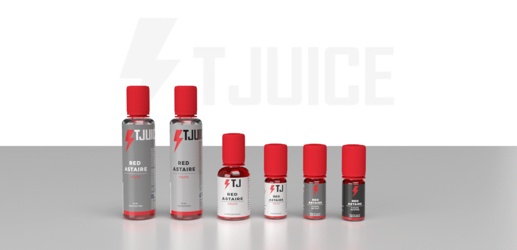
THE GREY SYSTEM
The first system I developed focused on simplifying product selection. To achieve this, I introduced a color-based approach: darker tones represent ready-to-use items, while lighter shades indicate more customizable products. This visual distinction was designed to guide customers quickly and intuitively toward the right choice.
- 10ml Premix – Black
- 10ml Salt mix – Grey
- Shortfill – Light Grey
- Longfill – Off-white
- 10ml & 30ml Concentrates – White
FLAVOUR SYSTEM
Each product features a colored line running along the bottom, complementing the colored bolt that represents the flavor. In addition to the color system, we also introduced category labels beneath the flavor names to make product selection even more intuitive.
ADDITIONAL DETAILS
We paid close attention to detail across all packaging elements to enhance the overall experience. This included a spot UV finish over the logo on the back of the boxes, an embossed Bolt icon on the front, and a matte finish to give a premium feel from the very first touch. Importantly, all boxes and labels were designed to be 100% recyclable, ensuring sustainability remained a core part of the packaging solution.
BRAND GUIDELINES
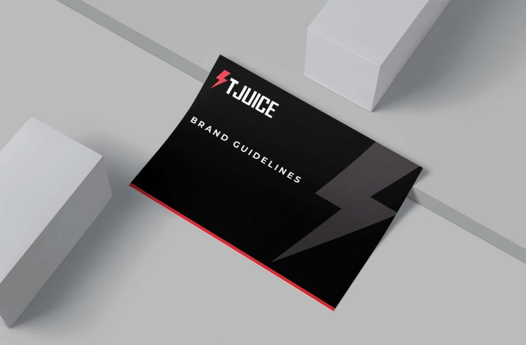
Once we finalized the packaging design and refined every detail, we documented the full set of guidelines developed throughout the process. Feel free to browse the document below.
I have to say, this was a truly rewarding project. I'm proud of how the final product turned out—it was a great opportunity to dive deep into the complexities of packaging design across different markets and regulatory environments (with a big thank-you to our regulatory team for their support). I was able to prototype various versions, experiment with finishes, and collaborate closely with different departments to ensure the best balance between aesthetics and functionality.
Ultimately, I delivered a refreshed look for the brand while preserving key elements from its previous identity. This is definitely a project I’ll look back on with pride.
Tools Used
- Adobe Illustrator
- Adobe InDesign
- Adobe Dimensions
- Adobe Photoshop
- Adobe After Effects

