Creation of PVRE
After launching our rebrand on T-Juice we have moved our focus to our first in-house hardware offering at Cuts Ice. This meant a new sub-brand with similar design languages to T-Juice but a completely new and younger look. The goal for this brand is give a high quality, environment friendly but affordable solution to help people give up smoking, our tagline greatly represent this:
Go PVRE, Go smoke free
Logo
Let’s start with the logo, we had multiple ideas for this but settled on the cleanest look allow us to use the logo creatively and not be limited by colors or additional icons.
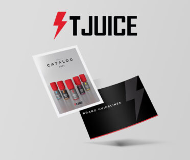
Brand Guidelines
After creating the logo the most important thing is to lay down the rules for the brand in our guidelines. To peak into the document feel free to click the image.

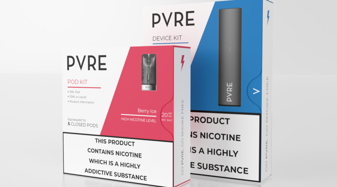
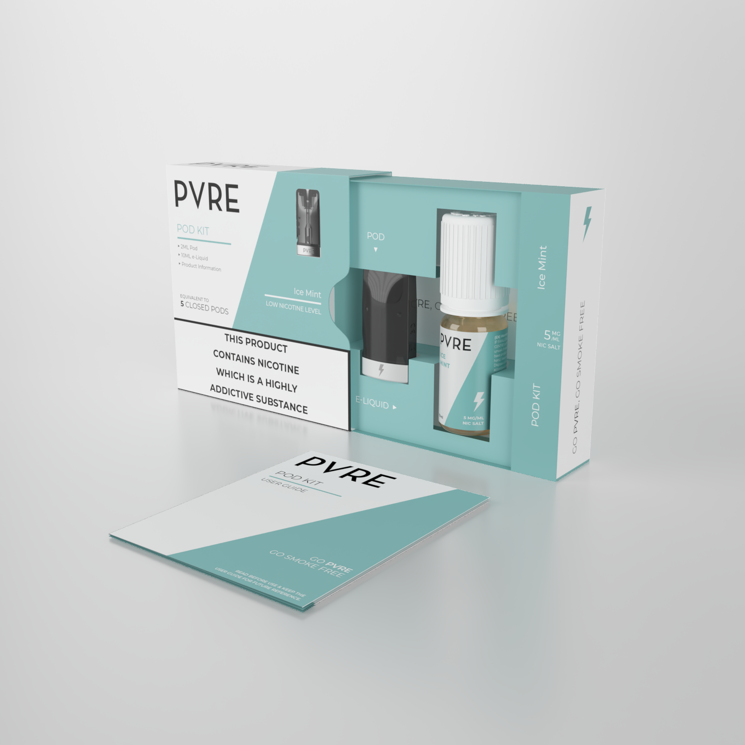
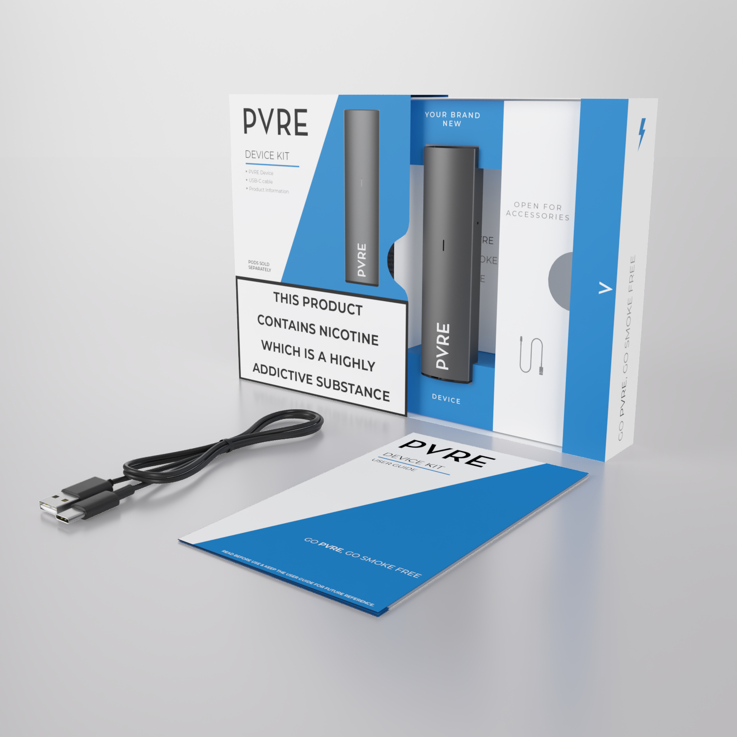
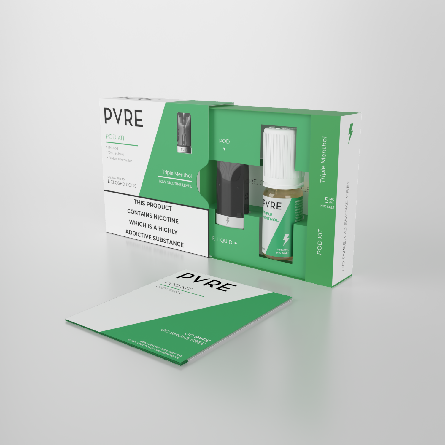
Package Design
We definitely wanted to bring across the bolt from our main brand (T-Juice) to draw similarities between the two brands, here we have not included the bolt in the logo but we have used as an additional element to our branding like addig the bolt to the side of the products as a flavour identifier. Additionally to the bolt we have created a holding device which has its angle based on the V in the logo giving us a more consistent design element across the applications. Taking our logo, tagline, bolt and the holding device we came to this design which works perfectly with our slide-out package design.
We have made sure the we apply small details across the product pieces, like the bolt on the white cap and the metal band on the Pod. Finally the finishing touches on the package design are the way they feel in customer hands, we have applied emboss effect on the logo, spot UV over the hardware and matt varnish across the paper while keeping all of our solutions 100% recyclable!
Overall, I am super happy with the result, it was a great experience to create something from scratch again, work out the guideline, design the packaging and even venture back into 3D to create product renders for our online presence.
RELATED PORTFOLIO